The world of web design is constantly evolving, and staying ahead of the curve is essential for any website owner who wants to maintain a competitive edge.
Your website’s layout is one of the most critical aspects of its design, and choosing the right one can make all the difference in attracting and retaining visitors.
In this blog, we will explore some of the top 10 website layouts in 2024, providing you with inspiration and insights to help you create a stunning and user-friendly website that will stand out from the crowd.
Upgrade Your Website With These 10 Cutting-Edge Design Layouts
Whether you are a blogger, an online retailer, or a business owner, these designs will help you take your website to the next level.
1. Z-Pattern Layout
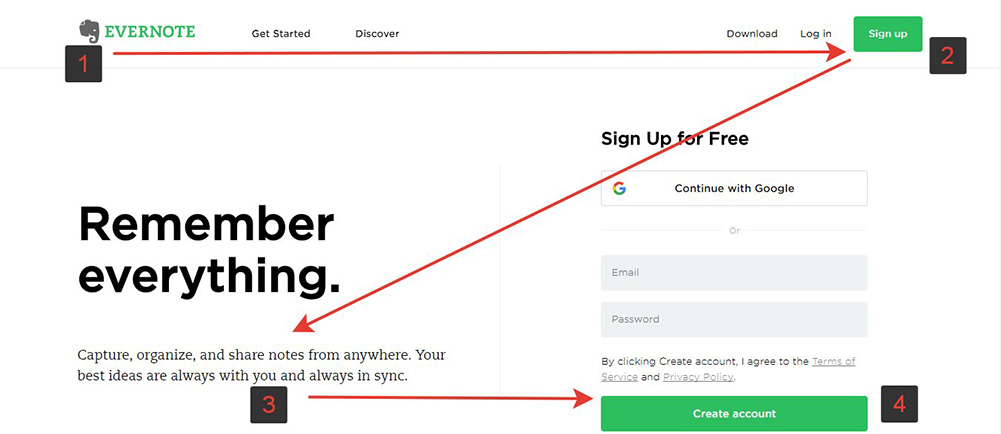
When a new website catches our eye, we tend to skim through it quickly to get a sense of what it’s all about. This behaviour, also known as skim reading, follows a Z-shaped pattern where our eyes go from the top left corner to the top right, then down to the bottom left, and finally to the right again.
The Z-pattern website layout is a clever way to take advantage of this natural reading habit. By strategically placing important information in a zig-zag fashion, it allows visitors to quickly and effortlessly absorb key content.
For instance, it’s common to place a logo in the upper left-hand corner of the homepage so that it immediately registers. On the opposite side, the navigation menu along with a prominent call-to-action can be located.
The most attention-grabbing information should be placed along the diagonal part of the Z-pattern, which spans across the page from top to bottom. This area can be optimized by using captivating visuals and a concise line of text that effectively represents what the website is all about.
As visitors reach the bottom of the Z-pattern, they should be presented with the most important call-to-action ( CTA ). This is where you can build up anticipation to purchase a product or book a service, and encourage visitors to take action.
This layout works particularly well for highly visual pages and landing pages that serve a specific conversion purpose.
By following this layout, you can ensure that your website’s most important information is presented in an organized and effective manner and that your visitors are more likely to engage with your content.
2. F-Pattern Layout
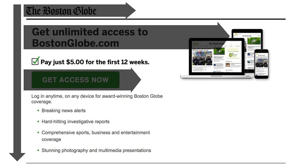
The F-pattern layout is a highly effective web design strategy that capitalizes on the natural page-scanning behaviour of users.
When presented with text-heavy web pages, users tend to skim or read in an F-shaped pattern, focusing first on the top horizontal section of the page, then scanning vertically downwards from the left-hand side.
In order to take advantage of this user behaviour, it’s crucial to invest in the top fold of your page where visitors are likely to linger longer. A well-crafted headline, compelling subtitle, and visually engaging featured image can entice users to explore further.
In addition, the inclusion of anchor texts to direct users toward relevant information and a navigation menu to guide them through the site can enhance the overall experience.
The left-hand vertical line of the F-pattern can be a powerful tool to make text more appealing. Employing imagery, icons, bullet points, and numbering can break up lengthy text and increase visual interest.
The F-pattern layout is particularly well-suited to websites that focus on text-based content. For bloggers, this website design is an ideal choice for both the homepage and individual blog post pages.
By following these design principles, you can create a highly engaging and intuitive website that delivers an exceptional user experience.
3. Fullscreen Image Layout
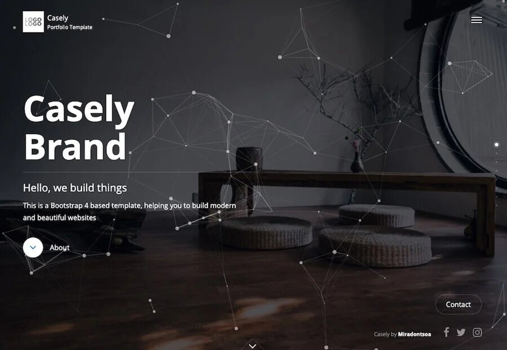
With an additional placement of large visuals in the front and center, a full-screen image layout turns out to be an appealing and eye-grabbing website design.
Large media features can easily convey a lot about your website and the products and services you offer. It looks great on mobile devices as well as on desktops.
Photographs or videos or illustrations can be used as a visual, but you need to ensure that they should be of premium quality and highly relevant to the products and services you offer.
You can further enhance your full-screen image by simply adding an engaging one-liner text to it. It’s the perfect platform for showcasing your niche products, whether it’s captivating photography series or heartwarming wedding moments that make you smile.
4. Split Screen Layout
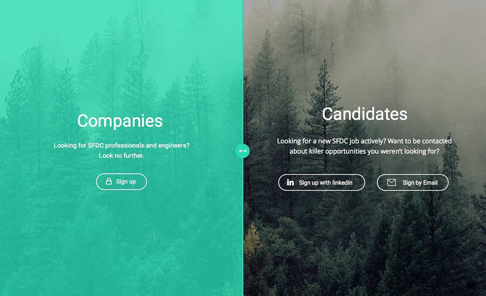
A split-screen layout is an interface layout that creates a balanced yet symmetrical website design. With a vertical divide down the middle, this layout allows each section to express a distinct idea or support a single concept from different perspectives.
Consider using this layout when you want to showcase two contrasting categories, such as the ‘ Men’s ‘ and ‘ Women’s ‘ section on an eCommerce website.
However, if you want to combine written copy and visual content in an engaging manner, a split-screen layout could be the perfect solution.
To add an extra layer of visual interest, try incorporating motion into each side of the screen. For example, you could experiment with parallax scrolling effects on one side while keeping the other static.
And, for even more creativity, consider extending the layout onto the second fold of your design while swapping the content on each side of the screen.
Whether you are running an online store that segments users by age or gender, or simply want to showcase multiple types of content in a balanced and visually appealing way, the split screen layout is an excellent option.
5. Asymmetrical Layout
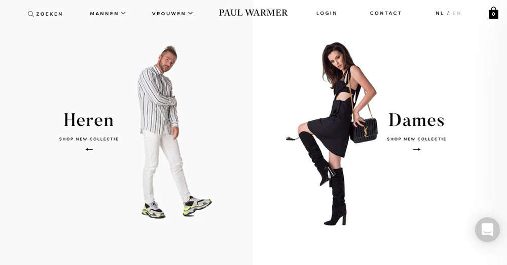
Unlike a traditional split screen layout, this layout adds a dynamic element by shifting the balance of weight from one side to the other.
By strategically distributing scale, color, and width, you can direct visitors’ attention to specific elements, creating a more engaging user experience.
To achieve this effect, identify which parts of your content you want to highlight and give them visual weight by increasing their size, boldness, and brightness. This will draw the attention of visitors and encourage them to engage with your content.
An asymmetrical layout is a great choice for websites that want to convey a temporary and innovative feel while driving user engagement. Whether you are creating a business website or an online portfolio for a design agency, an asymmetrical layout can help you achieve your goals.
So, why settle for a traditional layout when you can create a design that is both stylish and effective?
6. Single Column Layout
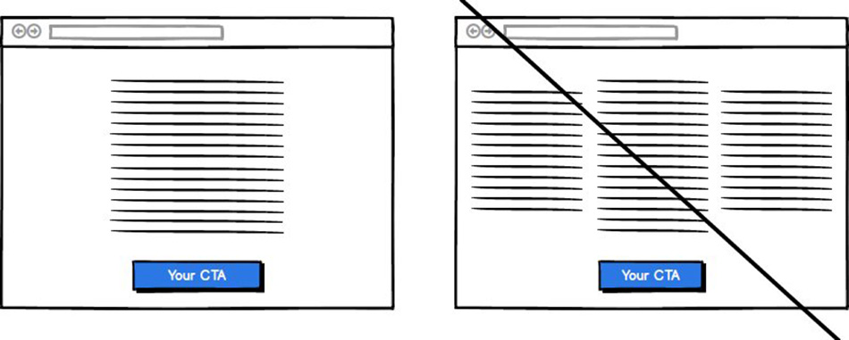
In this layout design, all the content is included in one vertical column. It’s an exceedingly simple yet straightforward design that is used on every page of the website.
However, it is essential to keep one thing in mind while using this layout. Adding a ‘ Back to top ‘ button or a fixed menu can help your potential users further explore your website.
By providing easy access to the top of the pages or navigation links, it becomes easy for your visitors to find what they are looking for.
Another important consideration while using the single-column layout is to break up the text with images, line breaks, headers, or subheaders.
This is one of the best layout ideas when it comes to websites that tend to have long-form content or websites that display content in chronological order.
7. Box-Based Layout
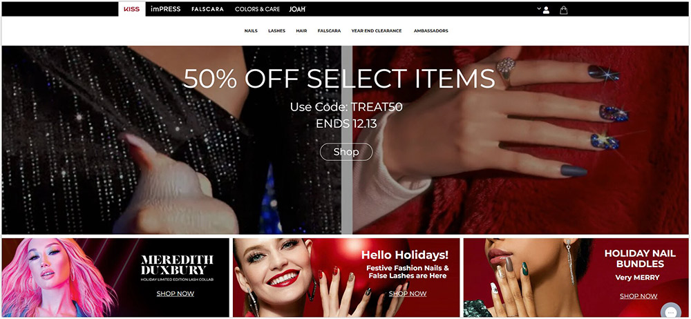
It’s a popular technique most commonly used by web designers to create visually appealing and responsive websites. It involves using HTML and CSS to arrange website elements into boxes, which can be further manipulated to achieve the design goals.
The advantages of this technique include its flexibility, ease of use, and ability to adapt to different screen sizes and resolutions.
By breaking a web page into boxes, designers can easily create a clear visual hierarchy and help users navigate the site more effectively and efficiently.
This method also allows for greater control over the placement of elements and the overall design aesthetic. In the world of web design, box-based layout is a key tool for creating modern, user-friendly, and professional-looking websites.
8. Cards Layout
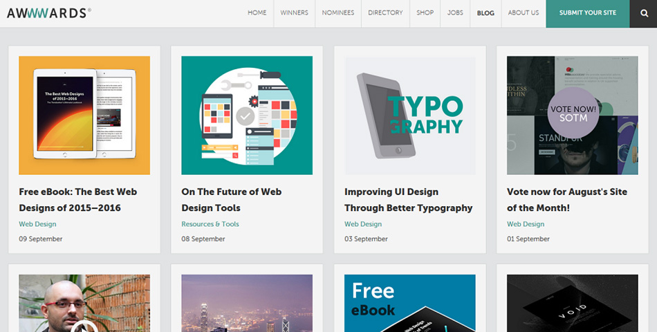
A card layout is a fantastic choice for websites with a wealth of content, such as vlogs or online stores. This layout features multiple rectangular containers, similar to a box-based layout, which present various types of content in an organized and visually appealing manner.
Unlike a hierarchical layout, the card layout treats all information equally, ensuring that each item receives the attention it deserves.
One of the key advantages of a card layout is its modular design which facilitates easy integration of content into identical, well-defined boxes.
This makes the layout suitable for all screen sizes and enables intuitive and seamless browsing, even when presented with vast amounts of information.
This results in an enhanced user experience that is both approachable and engaging. From online stores to multimedia-rich blogs, the card layout might be just what you need. Its visually appealing and flexible design makes it a great choice for a range of applications.
9. Magazine Layout
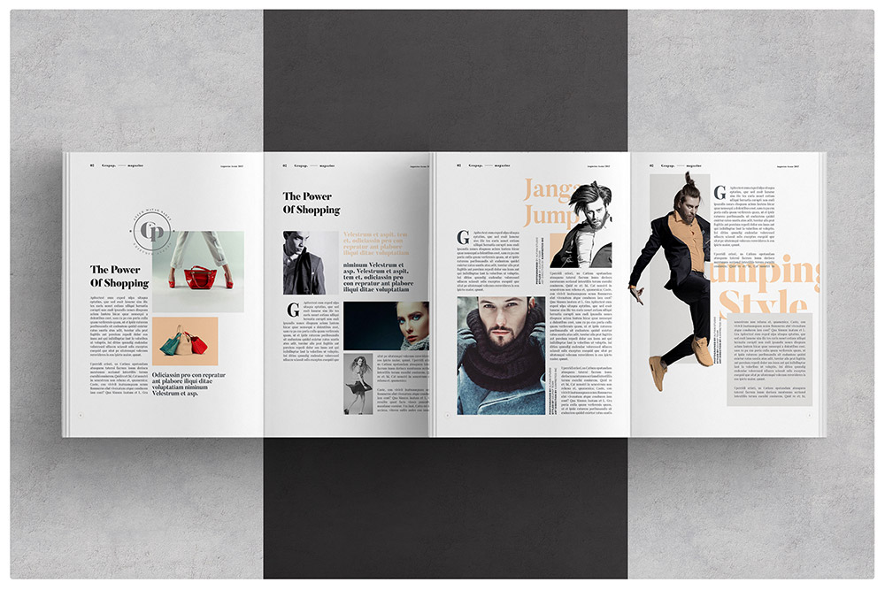
The art of magazine design draws inspiration from the traditional layout of printed newspapers, employing a multi-column grid to create a sophisticated visual hierarchy.
With the ability to customize individual containers, the magazine layout allows for the strategic placement of major headlines to command attention, while smaller articles are given their due prominence.
By skillfully manipulating the size and placement of elements, as well as the level of design detail, a magazine layout creates an alluring reading experience that draws the reader in.
For instance, larger images and headlines naturally grab our attention, while the article placed at the top of the page tends to be the first we read.
Similarly, articles accompanied by photos are more captivating than those with plain text. In order to cater to our decreasing attention spans, magazine layouts also utilize the F shape skim reading pattern in combination with a more intricate grid.
This helps to break down large amounts of information into easily digestible chunks while retaining a sense of order and an uncluttered design. The result is a captivating visual narrative that keeps readers engaged and informed, making magazine design an essential tool in today’s media landscape.
10. Horizontal Strips Layout
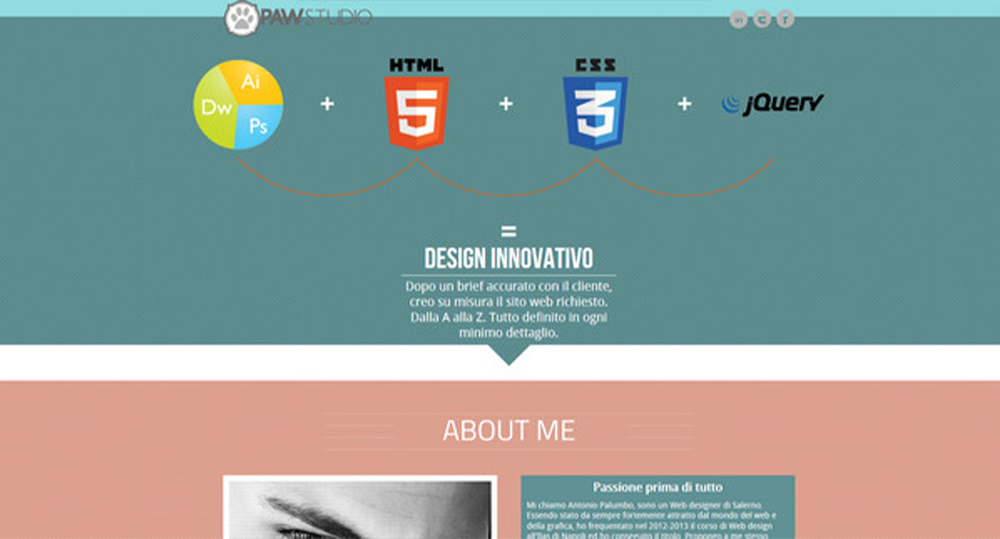
The layout of this website breaks up the long scroll into visually captivating full-width strips, which create an exciting and unique experience for users with each new fold.
By incorporating different shades from your color scheme that varies between images and written content, you can make each strip distinct and engaging.
You can also add dynamic effects like parallax scrolling to inject a sense of movement and depth into the website’s background.
This layout is especially advantageous for one-page websites, particularly those with long scrolling designs, as it provides an innovative and stimulating way for users to navigate the content.
Bottom Line
Keeping up with the latest website layouts and designs is essential for staying ahead of the curve in the digital world. The website layouts mentioned in the article are just a few examples of the many innovative and exciting designs that are expected to trend in 2024.
By implementing these layouts and adapting to the changing digital landscape, you can ensure that your website stands out from the crowd and provides a seamless user experience that keeps visitors coming back for more.
Digital Gravity’s expert designers combine creativity with functionality to create top website layouts that perfectly reflect your brand’s unique identity and goals. Trust us to deliver top-tier results that will leave your visitors wanting more.

